Have you ever found yourself staring at a spreadsheet, feeling overwhelmed by the sheer volume of data? You’re not alone. Excel sheets can be daunting, especially when filled with countless rows and columns. But what if we told you there was a simple trick to make your data easier to digest? By applying alternate row coloring, you can instantly transform your spreadsheet into a more visually appealing and organized workspace.

Image: namebasta.weebly.com
Alternating row colors in Excel helps create distinct visual breaks, making it easier to track data patterns and highlight important information. This simple yet effective technique can significantly enhance your spreadsheet’s readability, improve data analysis, and even present your work more professionally. In this comprehensive guide, we’ll unravel the steps to mastering this useful Excel skill, exploring both the classic methods and the latest features to help you unlock the power of alternate row coloring.
Understanding the Power of Visual Structure
Breaking Down the Wall of Data
Imagine a page of text without any breaks or paragraphs. It would be an overwhelming wall of words, making it difficult to decipher the information. Similarly, a spreadsheet filled with solid blocks of data can be just as challenging to navigate. Alternating row colors provide a visual structure, much like paragraphs break up text. This structure enhances readability by:
- Creating Visual Breaks: The alternating colors act as guides, separating rows and making it easier to follow data across the sheet.
- Improving Focus: The color contrast draws the eye to specific rows, making important information stand out.
- Enhancing Organization: By highlighting every other row, you create a visual pattern that helps to track data trends and make comparisons.
Beyond Aesthetics: Enhancing Data Analysis
While the visual appeal of alternating row colors is undeniable, its benefits extend beyond aesthetics. This simple technique has the potential to significantly improve data analysis in several ways:
- Identifying Trends: The visual breaks reveal patterns in data more easily. You can quickly spot trends, anomalies, or outliers that may be overlooked with plain, uncolored rows.
- Streamlining Comparisons: Alternating colors can highlight comparisons between rows, making it easier to analyze data side-by-side and draw conclusions.
- Improving Efficiency: The clearer visual structure allows you to navigate the spreadsheet more efficiently, leading to faster data analysis and quicker problem-solving.

Image: jazztere.weebly.com
The Classic Method: Using Conditional Formatting
For seasoned Excel users, conditional formatting has always been a go-to tool for applying alternate row colors. Here’s a step-by-step breakdown to guide you through the process:
1. Selecting the Target Range
Begin by selecting the rows you want to color. If you want to apply alternate colors to the entire spreadsheet, simply click on the row header (the number 1, 2, 3…) to select all. If you want to color only a specific set of rows, click and drag over the rows you want to apply coloring.
2. Accessing Conditional Formatting
With your target range selected, navigate to the Home tab in the Excel ribbon. Locate the Styles group and click on the “Conditional Formatting” button. This will reveal a drop-down menu with various options.
3. Choosing the Right Rule
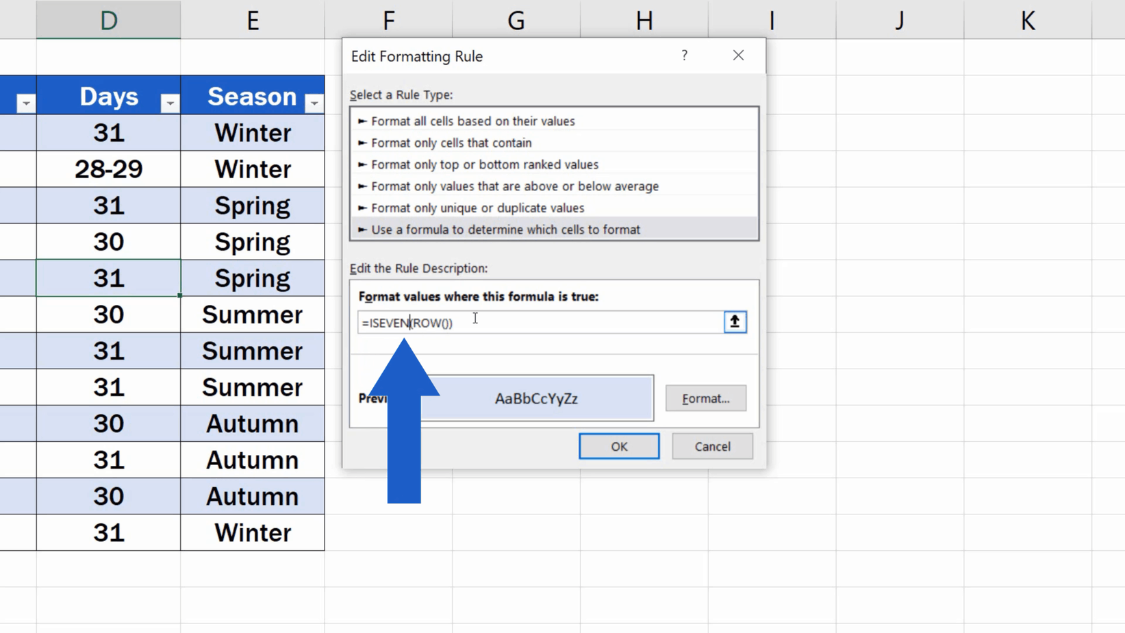
For alternating row colors, you’ll want to use the “New Rule…” option. In the New Formatting Rule dialog box, select “Use a formula to determine which cells to format.” This option provides the flexibility to create a rule that will automatically color rows based on their row number.
4. Building the Formula
This is where the magic of conditional formatting truly shines. The key is to use a formula that checks the row number and applies a format accordingly. Here’s the formula you’ll need:
=MOD(ROW(),2)=0
Let’s break down this formula:
- MOD(ROW(),2): This part calculates the remainder when the row number is divided by 2.
- =0: This checks if the remainder is equal to 0. If the remainder is 0, the row is even; otherwise, it’s odd.
5. Applying the Format
Once you’ve entered the formula, click on the “Format” button to choose the color you want for the even rows. You can select any color from the palette available. You can then use the “Add” button to create a second rule for the odd rows and select a different color. Finally, click “OK” on all dialog boxes to apply the conditional formatting.
Beyond the Basics: Exploring Advanced Options
While the traditional conditional formatting method is effective, Excel offers other features that enhance the way you can create and manage alternate row colors. Let’s delve into some advanced options that provide greater flexibility and control:
1. The “Format Painter” for Quick Replication
If you find yourself repeatedly using the same alternate row color scheme for different sections of your spreadsheet, the “Format Painter” tool is your best friend. Once you’ve applied the conditional formatting to one range of rows, simply select the format painter by clicking on the brush icon in the Home tab. Then, click and drag over the other rows where you want to apply the same format. The painter quickly replicates your color scheme, saving you time and effort.
2. The “New Table” Format for Automated Styling
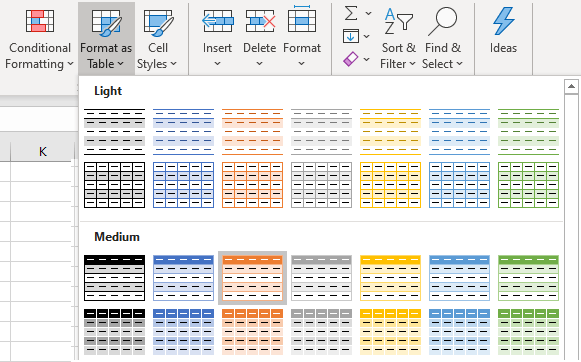
Excel’s “New Table” function is more than just a way to organize data – it’s a powerhouse of automated formatting. When you convert your data into a table, Excel applies a default style that includes alternating row colors. This saves you the hassle of manually creating a new rule for conditional formatting. You can also customize the table’s appearance by selecting from a variety of built-in table styles or even defining your own custom styles.
3. The “Format as Table” Feature for Existing Data
If you have an existing dataset and want to apply the “New Table” formatting, no problem! Simply select the data range and click on the “Format as Table” button in the Home tab. You can choose from various table styles, and Excel automatically applies alternating row colors, creating a well-structured table with minimal effort.
Embracing the Modern Touch: Using Excel’s Built-in Themes
With the latest releases, Excel has introduced a new level of design flexibility with its built-in themes. Themes act as pre-defined color palettes that you can apply to your spreadsheets. Many of these themes feature alternate row colors as part of their visual style. To access this feature, navigate to the Design tab in the Excel ribbon and explore the different theme options. You can effortlessly change the overall look of your spreadsheet, including the row colors, with just a few clicks.
Beyond Spreadsheets: A Visual Approach to Presentations
You may be surprised to learn that the concept of alternating colors extends beyond spreadsheets. This visual technique can be incredibly valuable in creating presentations that captivate your audience and make information easy to grasp. Whether you’re using PowerPoint or a similar presentation tool, applying alternate colors to your slides can create a visually appealing structure, emphasizing key points and guiding the audience through your message.
How To Make Rows Alternate Colors In Excel
Conclusion
From enhancing readability to simplifying data analysis, adding alternate row colors is a simple yet powerful technique that can significantly impact your Excel experience. Whether you’re a data enthusiast, a professional seeking to improve reports, or simply someone looking to bring order to their spreadsheets, mastering this skill can make a world of difference. Embrace the power of color and see how it can illuminate your data, allowing you to uncover insights you might have otherwise missed.


