Have you ever marveled at the breathtaking sunset, its fiery oranges and deep purples dancing across the sky? Or perhaps stood before a masterpiece, captivated by the artist’s masterful use of color? Color, a fundamental element of our world, holds an undeniable power to evoke emotions, stimulate our senses, and even influence our behavior. But beyond its aesthetic appeal lies a fascinating world of scientific principles known as color theory.

Image: www.slideshare.net
Color theory, at its core, is the study of how colors work together to create particular visual effects. It explores the relationships between colors, their interactions, and the psychological impact they have on our perception. Understanding color theory can be a transformative tool for anyone who works with visual elements, whether you’re a painter, graphic designer, interior decorator, or simply someone who wants to create visually pleasing spaces. But with so much information out there, it can be challenging to separate fact from fiction. So, let’s dive into some common statements about color theory and see which ones hold true.
The Basics of Color Theory: A Primer
Color Wheel: The Foundation of Harmony
The color wheel, a circular representation of colors arranged according to their relationships, forms the bedrock of color theory. It’s a visual map that reveals the interconnectedness of different hues and helps us understand how they work together. The most common color wheel is based on the three primary colors – red, yellow, and blue – which cannot be created by mixing other colors. Secondary colors, such as green, orange, and violet, are formed by mixing two primary colors. Tertiary colors, on the other hand, are created by mixing a primary color with a neighboring secondary color.
Color Schemes: Creating Visual Harmony
Color theory provides a set of guidelines for choosing color combinations that are visually pleasing and harmonious. These guidelines are often referred to as color schemes. Some popular color schemes include:
- Analogous: Colors that are adjacent to each other on the color wheel, like blue, blue-green, and green. This creates a sense of unity and fluidity.
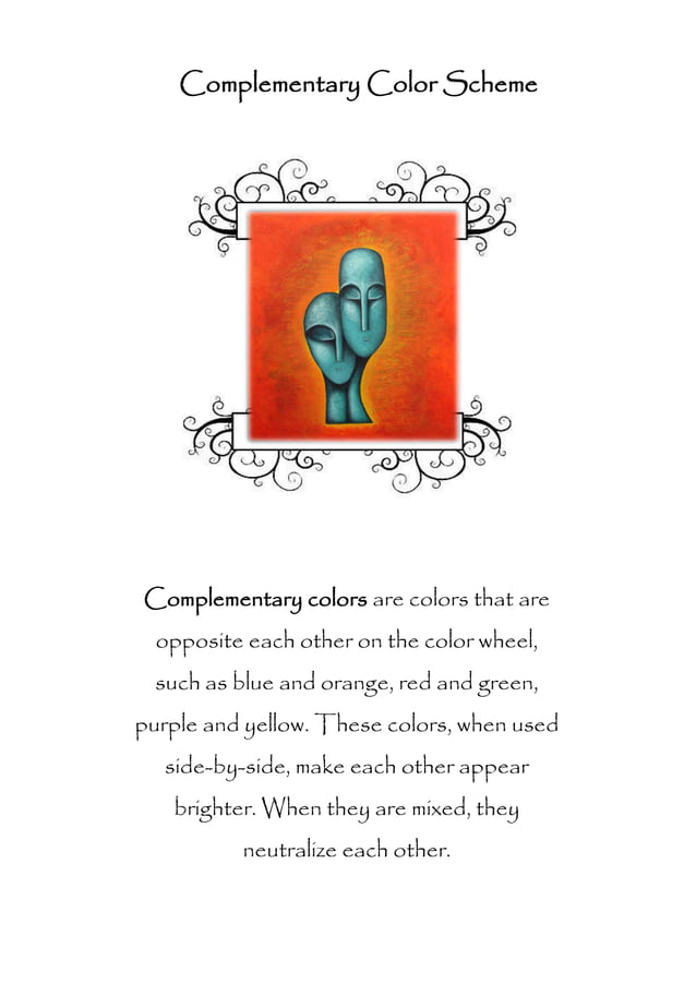
- Complementary: Colors that are opposite each other on the color wheel, such as red and green. They provide a strong contrast and can create a vibrant, eye-catching effect.
- Triadic: Three colors that are equally spaced on the color wheel, like red, blue, and yellow. This scheme offers a balanced and harmonious feel.

Image: studylib.net
Color Temperature: Warmth and Coolness
Colors can be classified as warm or cool based on their association with various temperatures. Warm colors, like red, orange, and yellow, evoke feelings of warmth, energy, and excitement. They are often used to create a sense of intimacy and comfort. Cool colors, such as blue, green, and violet, on the other hand, are associated with calmness, tranquility, and relaxation. They can be used to create a sense of spaciousness and serenity.
Debunking Color Theory Myths: Fact vs. Fiction
Now, let’s address some common misconceptions surrounding color theory to separate truth from fiction.
Myth #1: “Blue Is Always Calming”
It’s true that blue is often associated with calmness, but its effect can vary depending on the shade and context. A bright, electric blue can actually be quite stimulating, while a deep navy blue can feel more sophisticated and even slightly melancholic.
Myth #2: “Complementary Colors Should Never Be Used Together”
While complementary colors provide a strong contrast, they can be used effectively when balanced and used in moderation. A splash of red against a green background can add a dramatic focal point, but using too much of either color can lead to visual fatigue.
Myth #3: “There’s Only One ‘Right’ Way To Use Color”
The beauty of color theory is its flexibility. There are countless ways to combine colors, and the ‘right’ way often depends on the specific purpose, desired effect, and personal interpretation. Experimenting with different color schemes and seeing what works best for you is key to developing your own unique style.
Color Theory in Action: Real-World Applications
Color theory isn’t just for artists and designers; it’s a powerful tool that’s used in various fields, impacting our daily lives.
Marketing and Branding
Companies use color theory to create strong brand identities and evoke specific emotions in consumers. For example, the color red often signifies passion and excitement, making it popular for fast-food chains and sports teams. Blue, on the other hand, is associated with trust and reliability, making it a common choice for financial institutions and healthcare providers.
Interior Design
Color plays a crucial role in creating mood and ambiance in interior design. Warm colors can make a space feel cozy and inviting, while cool colors can create a sense of calm and tranquility. Understanding the psychological impact of colors allows interior designers to carefully choose colors that complement the environment and enhance the overall feeling of a space.
User Interface Design
In the digital world, color theory is essential for creating effective and user-friendly interfaces. For instance, a website’s color scheme can influence a user’s perception of the brand, their engagement with the content, and their overall experience.
Psychology and Neuroscience
Research in psychology and neuroscience has shown that color can affect our mood, behavior, and even our brain activity. Certain colors can help reduce stress and promote relaxation, while others can increase alertness and focus. This understanding has led to the use of color therapy as a complementary treatment approach for various mental and emotional conditions.
The Ever-Evolving World of Color Theory
Color theory is not a static science; it’s a continuously evolving field influenced by new discoveries in psychology, neuroscience, and technology. New color systems, tools, and techniques are constantly emerging. For example, the development of Pantone’s Color of the Year has become an annual event eagerly anticipated by designers and businesses around the world. This annual selection reflects changing cultural trends and perceptions, showcasing the dynamic nature of color and its influence on society.
Which Statement About Color Theory Is True
Conclusion
Understanding color theory allows us to see beyond the surface of colors and appreciate their intricate relationships and subtle effects. Whether you’re an artist, designer, business owner, or simply someone who enjoys the world of color, exploring the principles of color theory can unlock a wealth of possibilities for creating engaging, impactful, and meaningful visual experiences. So, start exploring the color wheel, experiment with different color schemes, and let your creative journey begin!


